
A post by Mike Smith at the Readership Institute includes a remark that "Web use of news sites peaks at noon, creating a perfect bell curve." This prompted me to take a look at a typical weekday's composite daily usage curve for Morris websites, which I hadn't done in awhile. It looks like this:
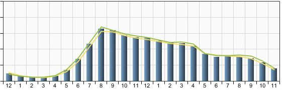
It's not the bell curve that Smith describes, and notably the usage in the late afternoon and at-home evening hours is stronger than I've seen on many newspaper sites over the years. Although I don't have really good tools at my disposal to analyze shifts in the types of content that engage users across the hours, my suspicion is that the effective use of community interaction tools (including Spotted®) is boosting usage later in the day.
When I was at Cox Interactive in 1999-2000, I saw two radically different pictures.
Newspaper sites then had two pronounced peaks: first thing in the morning and at noon. Usage dropped radically in the afternoon and pretty much evaporated in the evening.
On the other hand, Cox broadband cable markets had the opposite picture, with very low daytime usage and very intense evening, at-home usage.
Brands are powerful, and regardless of how hard the newspaper markets worked to develop non-newspaper content, they were saddled with a consumer perception that the sites were largely built out of yesterday's news, updated in the morning. And no matter how hard the local cable studios worked (usually with offline media partners) to build morning news fodder, they were swimming against the current.
Comments
Three peaks a day
In our tiny corner of the web, we get three spikes a day. The big one is at about 8 am, when everyone gets to work and checks their e-mail and news. We get a second, smaller spike at noon. The third spike, at about 4 pm is even smaller, but noticeable. Folks are making sure the world didn't blow up before they wander off into it.
We get fractional traffic at night.
It's pretty clear that the web, at least the news end of it, is an at-work medium.
The changing peaks
We used to see a curve that looked more like geometric digression, with a big peak early in the morning and pretty fast tailing off for the rest of the day, with a small bump at lunch.
Then we instituted a program of hourly updates, and now our sites look a lot like your graph above, with some of them getting a pretty good peak at about 4 pm.
We are starting to see changes in user behavior as we get away from this once-a-day publishing cycle.